The past five weeks have been insanely busy for me, between the Business Master Class and the fall leaf clean-up, but that “busy” has actually been fun for a change. The class was informative and empowering, absolutely worth every penny. I feel as though I’ve finally found my tribe. Like me, these writers are serious about both the art and business of writing, and they can see past the current marketing myths that many indie authors buy into. They also share the belief that it’s not necessary to tear others down to build oneself up, which is a refreshing contrast to much of the publishing world.
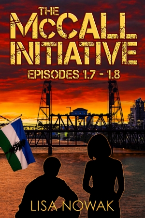
One of the things I’ve been working on since this class is re-designing the box set covers for The McCall Initiative. I wanted to brand them to the genre, in other words make them look similar to covers of other YA dystopian books. This is important because if a reader doesn’t get a clue of what a book is about from the cover, they’re less likely to buy. (Imagine if a romance novel had a gun and police tape blazoned across it, or a horror story featured a basket of snuggly kittens.) After looking over a variety of dystopian and post-apocalyptic covers, I noticed two distinct patterns. One type of cover featured symbols (The Hunger Games, Legend) and the other had crumbling cityscapes with small images of kids, often in silhouette and looking into the distance. I wanted my city images to be of Portland, as a sort of Easter egg to those familiar with the area. And, because Cascadia hasn’t been hit hard by the climate crisis, I decided to go with an eerie sky instead of buildings in ruins. The Doug flag image was important to keep, another Easter egg for those who know its meaning, but I wanted to make it less prominent.
A friend at the conference had told me about some great software called Affinity Photo. It’s a lot like Photoshop, but it only costs $50, with free upgrades for life. I spent about a week learning enough about this program to mock up some covers to send to Steven, my designer. Over the course of the following week, we went back and forth with changes to the first cover until Steven told me he thought I was capable of designing these myself. I wasn’t entirely convinced, considering I wanted to use the sinister sunset from the first cover for all the others. That meant not just replacing the sky, but also figuring out how to get the reflection on the water to match. And, in the case of the final cover, I had to make a photo I shot in early November look like it had been taken in summer. (There weren’t any stock photos of this particular angle, which shows two Portland landmarks that feature in the final episodes.) Not only was it necessary to adjust color and contrast, I also had to put leaves back on the trees. Steven agreed to help me make adjustments to the photos once I had all the masking done, but in the end, I figured out how to do it myself.
Here’s what I came up with. These probably won’t win any contests, but I think they do a better job of informing the reader of genre than the originals did. What do you think?
“New Covers,” copyright © 2017 by Lisa Nowak.
If you enjoy my books and want to make it easier for me to write them, please consider one of the following:
- A one time PayPal donation: https://www.paypal.me/LisaNowakAuthor
- A small monthly contribution (as low as $1) on Patreon: https://www.patreon.com/lisanowak


 Subscribe
So cool and hip! Maybe that language dates me!
LikeLiked by 1 person
Thank you, Rose. 🙂
LikeLike
I love the new covers! Much better, IMHO.
Also, I’d buy a horror story with cuddly kittens on the cover. Especially if they were actually demonic kittens who lull unsuspecting folks into adopting them before turning them into human scratching posts in the dead of night.
Oooh…my next book just half-wrote itself….
LikeLiked by 1 person
I knew someone was going to comment on those kittens. Figures it would be you. 😉
LikeLike